
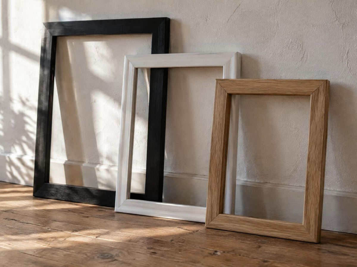
The frame changes how a print meets the room. It can make a quiet image feel graphic, soften a strong colour or connect several different pictures. Start with the artwork and the surrounding space rather than a rule about which finish is best.
Black frames create a clear edge
Black works well when the image contains dark lines or strong contrast. It can connect photography, typography and a delicate drawing in one arrangement. On a pale wall, the frame becomes part of the composition, so check that it does not overpower a very light print.
White frames keep the outline light
White can blend into a light wall and let the subject take the lead. It is useful for soft landscapes and airy bedrooms. Compare the frame with the actual wall colour: a bright white frame against warm cream may look more distinct than expected.
Wood introduces warmth
Natural and darker wood finishes echo timber furniture without needing to match it exactly. A light frame often suits botanical work; a darker finish can give warm photography more depth. Look at the dominant wood tones in the room before adding another.
Check size and finish separately
Choose the frame for the print dimensions, then consider the total outside size on your wall. Product options determine which finishes and sizes are available. Do not assume every design offers every combination.
Use the frame guide alongside the poster size guide. For a mixed arrangement, repeat one finish in at least a few frames to create continuity, then test your layout with paper templates before hanging.