
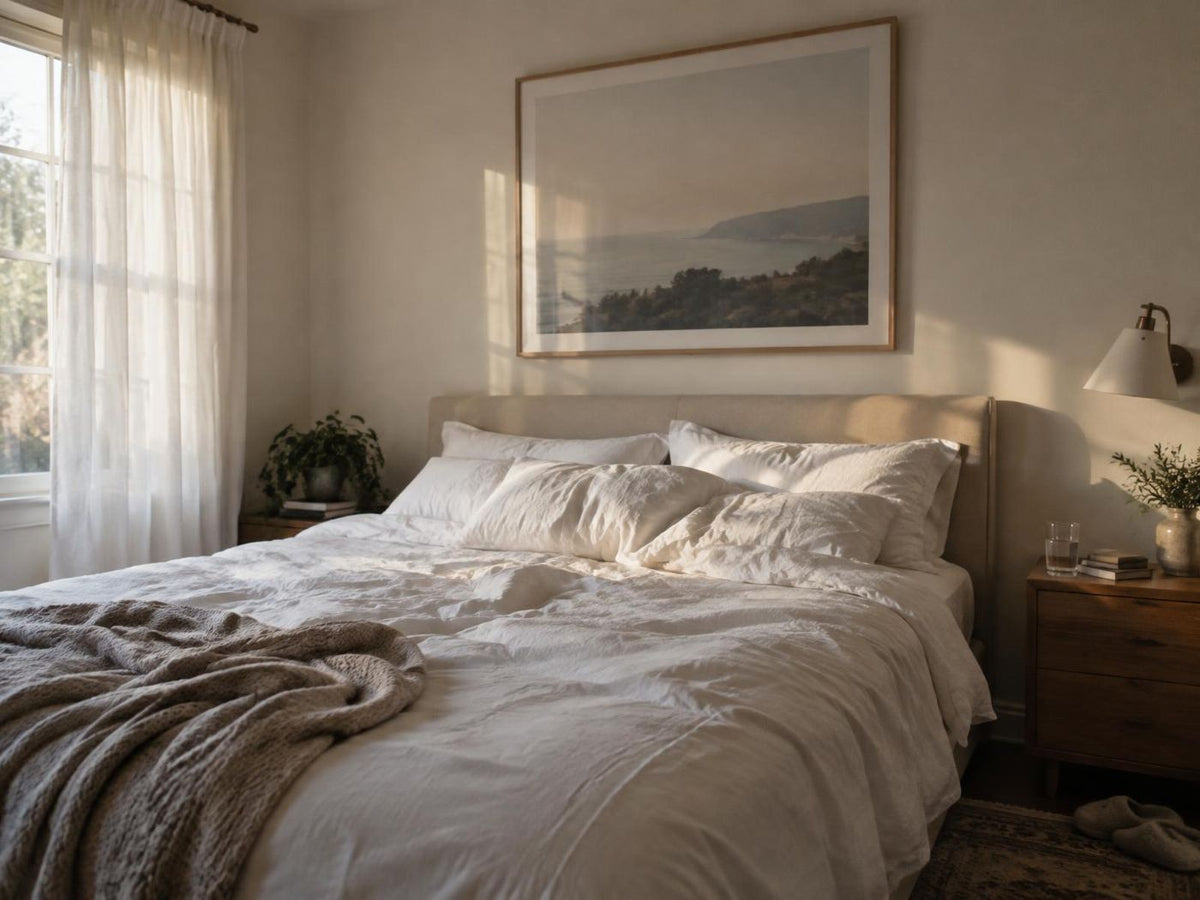
A bedroom does not need a completely neutral palette to feel restful. What matters is how the colours, shapes and furnishings sit together. Art is a useful place to introduce personality while keeping the room visually comfortable.
Borrow a colour already in the room
Look at the bedding, curtains or a favourite cushion. Choose a print that repeats one of those shades, perhaps in a softer or darker version. Botanical greens, dusty blues and warm earth tones can work well, but the best starting point is a colour you enjoy.
Choose the view you want to wake up to
Art above the bed is visible when you enter the room. Art on the opposite wall is what you see while resting. Think about both viewpoints before deciding where the main piece belongs. A small print on a dresser can be just as personal as a large work.
Keep the arrangement simple
One larger print can give the room a clear focal point. A pair creates a gentle rhythm, especially when the pieces share a palette or a horizon line. If you prefer a gallery wall, leave a little more space around the whole group so it does not compete with patterned bedding.
Check the light and the frame
View your chosen colours in daylight and under the lamps you use in the evening. Glass can reflect a window or bedside light, so try the placement before fixing it permanently. Use fittings appropriate for the frame weight and your wall type, and follow the fitting manufacturer's instructions.
Start with the bedroom collection or explore Quiet moments. For proportion, compare your options in our size guide.